
How to Make Beautiful Visualizations for Your Business Storytelling
What NYT, The Pudding, FT and 3Blue1Brown have in common, why a chart library can't make you look good, and how to design interactions that explain instead of merely demonstrate.

On this page
- Five houses that look nothing alike
- The title of a chart is a claim
- Five disciplines that travel
- One accent, and grey for everything else
- One change at a time
- The same object moves; it never gets deleted and redrawn
- The annotation is where the professional look lives
- Whitespace is hierarchy, not decoration
- The play button that explained nothing
- Keep the map on the screen
- The tools, honestly
- The checklist
- References and source passages
- Primary sources for the principles
- Exemplars, cited as examples of the discipline rather than as authorities
- Tools, cited for facts about the tool
Last week I built an animated diagram, showed it to myself, and realised it taught nothing. This is what I worked out afterwards: the disciplines that separate a chart that carries an argument from a chart that merely displays numbers. Written for founders, PMs and consultants who need a picture to do real work in a deck. Every link below was opened and read on 2026-09-03.
Five houses that look nothing alike
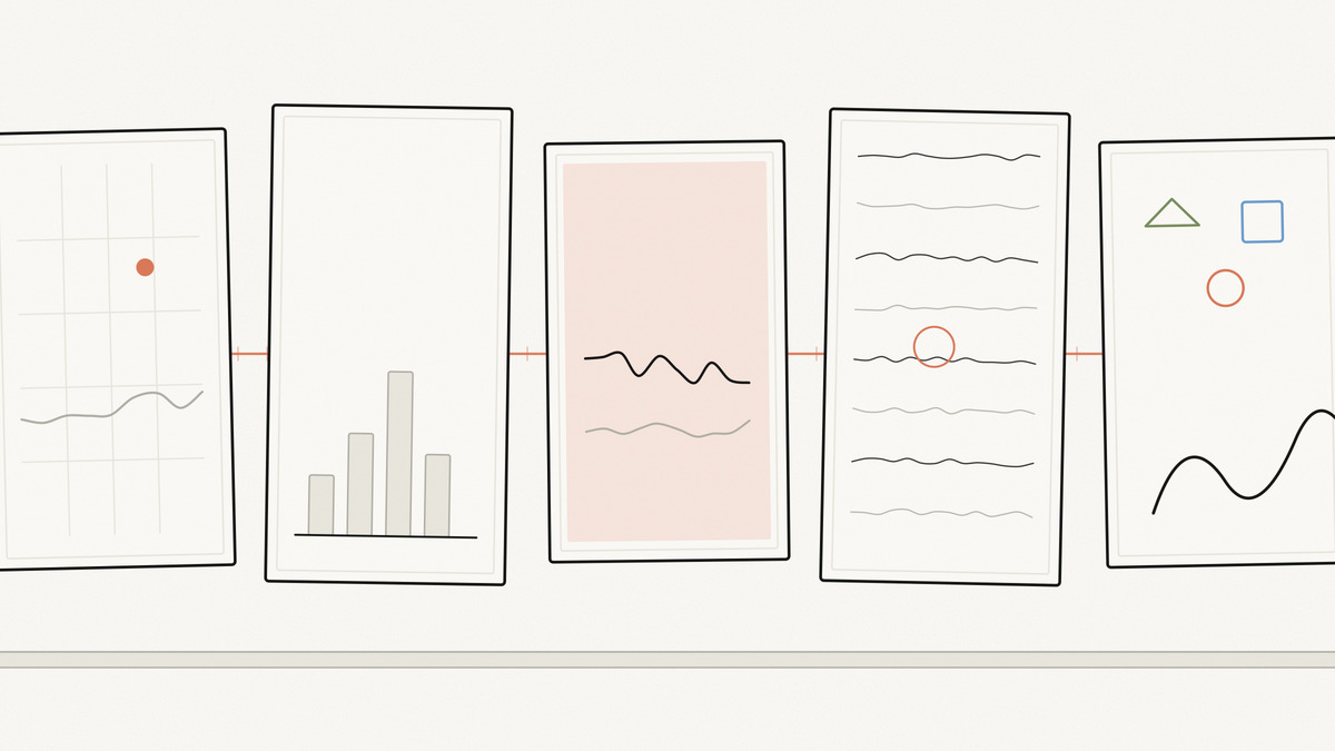
Put the work of the best explanatory-graphics shops side by side and the first thing you notice is that they share no style at all.
The New York Times Upshot runs cool greys with one editorial accent. The Pudding sets essays in big display type with a poem at the top. The Financial Times prints on salmon. Distill looked like a physics paper that had learned CSS. 3Blue1Brown is chalk-on-navy mathematics. Nicky Case draws wobbly cartoon shapes in primary colours.
No shared palette, no shared typography, no shared grid. And yet all of them produce work that a stranger will stop scrolling for, and most business charts are work that a paid colleague will skip. Nor is this the output of huge specialist departments. The Pudding’s own account of how it works describes a small generalist team drawing on “an odd grab-bag of skills”: critical thought, design, writing and programming.
So the “wow” is not a look. It is a set of disciplines, and the disciplines survive translation across wildly different houses.
Here is the part that stings if you were hoping to buy your way out. The most admired toolkit in this field ships no design whatsoever. D3’s own documentation says it is not a charting library in the traditional sense and has “no concept of charts”: you compose primitives, and what comes out is exactly as good as the decisions you made. The same page warns readers off the gallery directly, noting that many of the dazzling examples “took an immense effort to implement”, and that D3 makes sense for newsrooms like the Times and The Pudding where a graphic will be seen a million times and a team of editors works on it.
That is the honest frame for everything below. There is no theme to install. There are decisions to make, and they fit on a single checklist, which is how this piece ends.
The title of a chart is a claim
The single highest-return change most people can make costs no design skill at all: write the finding in the title, not the topic.
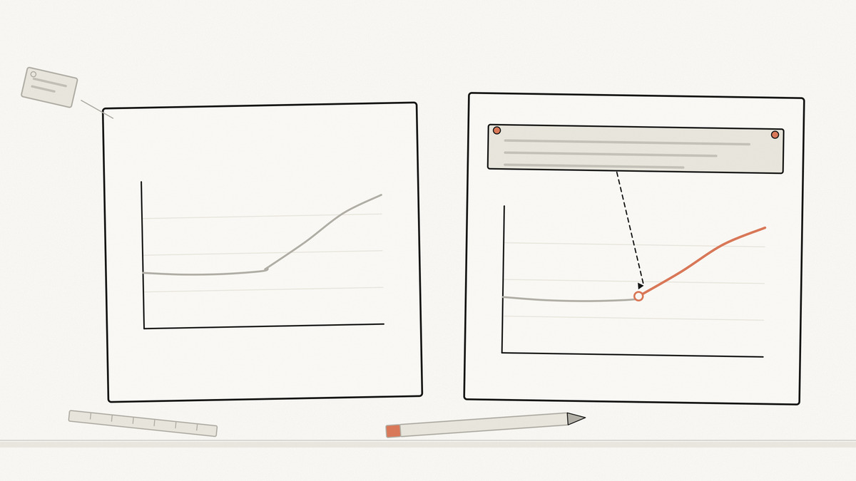
“Revenue by region, Q1–Q3” is a filing label. “Europe now carries growth; North America has been flat for three quarters” is a sentence someone can disagree with. The second one tells the reader what to look for, and it tells you whether the chart is even the right chart, because if you cannot write the sentence, you do not yet have a point.
This is my own working rule rather than a citable law, but you can watch a newsroom apply it at scale. The Upshot’s “How the Recession Reshaped the Economy, in 255 Charts” moves through sections called “A Mixed Recovery”, “The Medical Economy”, “A Long Housing Bust” and “Grooming Boom”. Not one of them names a variable. Each is a claim, and the small multiples underneath are the evidence. The piece also carries an explicit “How to read this chart” panel that spells out what each axis encodes, which is what you do when you are confident the reader is a stranger rather than the analyst who built it.
Two rules follow from the first one.
One chart, one message. Attention is single-threaded. A chart carrying three findings communicates none of them, because the reader has to choose which one to look for and will usually choose wrong.
Pick the chart type from the relationship, not from the menu. The Financial Times publishes its internal training poster, the Visual Vocabulary, for exactly this: it exists to help journalists select the optimal symbology for data visualisations, and it organises every chart type under the relationship it expresses, such as deviation, correlation, ranking, distribution and part-to-whole. The FT’s own framing is worth stealing: the poster is not an attempt to teach everyone how to make charts, but how to recognise the opportunities to use them effectively alongside words. Its note on correlation is the one I have seen violated most often in board decks: unless you say otherwise, readers will assume the relationship you show them is causal.
Five disciplines that travel
These are the ones that show up in every house I listed, whatever the house style.
One accent, and grey for everything else
Amateur charts colour every series. Professional charts colour the argument and grey the context.
Datawrapper, a charting vendor whose colour guide is widely used, puts it more strongly than I would dare: it asks you to treat grey as the most important colour in data visualisation, because greying the unimportant elements is what makes the highlight colour land. The same guide sets a ceiling: if you need more than seven colours in a chart, the answer is a different chart or grouped categories, not a bigger palette.
Keep semantic colours separate from your accent. If red means “at risk” anywhere in the deck, red cannot also be the colour of the EMEA series. And build sequential and diverging ramps from a tested set rather than by eye. D3’s palette module is derived from Cynthia Brewer’s ColorBrewer for that reason.
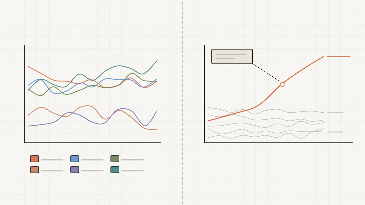
Before and after: a six-line chart in six colours with a legend, where the reader plays matching-game between legend and lines, becomes one dark line for the series you are arguing about, five light grey lines behind it, and the series name written at the end of its own line. Legend deleted. Same data, and now it has a subject.
One change at a time
The clearest statement of this discipline I have found comes from animation, not from data. Lasseter’s 1987 SIGGRAPH paper, restating the principles that Frank Thomas and Ollie Johnston had codified at Disney, defines staging as presenting an idea “so it is completely and unmistakably clear”, and then gives the rule directly: when staging an action, only one idea should be seen by the audience at a time, because if a lot is happening at once the eye does not know where to look and the main idea gets missed. The paper describes the animator as saying, in effect, “Look at this, now look at this, and now look at this.”
That is a build sequence. If your diagram has to add a data layer, recolour by segment and reveal an annotation, that is three steps, not one slide. On a static deck this is the humble appear-animation you were told was tacky; done as one change per beat, it is the difference between an audience that follows and an audience that reads ahead.
The same object moves; it never gets deleted and redrawn
When a chart changes state, every element that means the same thing before and after must be the same element, moved. This is Mike Bostock’s object constancy, and his essay is still the clearest account: a graphical element standing for a particular data point can be tracked visually through the transition, which shifts the work from reading labels sequentially to watching motion.
The mechanism, in D3 terms, is the key function: tell the join which field identifies a row, and Ohio stays Ohio across the update. Skip it and, as Bostock warns, the default join-by-index can be misleading, because bar three becomes bar three regardless of which state it now represents. You get a smooth, confident, wrong animation.
If you are not in D3, the same idea has a name in UI animation. The FLIP technique, coined by Paul Lewis, measures where things are, lets the layout change, then animates the difference away. GSAP’s implementation describes it as recording position, size and rotation, letting you make any change you like, and then applying offsets to make them look like they never moved.
Bostock also draws the boundary, which matters more than the technique: animation should only be used when it enhances understanding, and transitions between unrelated quantities should be a cut or a cross-fade rather than gratuitous movement. Bars flying between two unrelated metrics look expensive and mean nothing.
The annotation is where the professional look lives
Chart libraries render marks. Nobody’s library writes the sentence pointing at the outlier, and that sentence is most of the perceived quality gap.
A callout with a leader line that says “contract renegotiated here” on the month the line bends does more for comprehension than any amount of gradient work. This is unglamorous, manual, and the reason newsroom graphics look finished while dashboard graphics look raw. If you work in D3, Susie Lu’s d3-annotation exists precisely to make these first-class, with built-in annotation types you can extend to make custom annotations.
The rule I use: every chart that goes in front of another human gets at least one annotation, and if I cannot think of one, the chart has no finding and should be a sentence instead.
Whitespace is hierarchy, not decoration
Space is how you say what to read first. The Pudding’s pockets essay opens on a poem and a single word set in display type, then hands you 80 pairs of jeans; the finding, when it lands, is one sentence in its own space: women’s jeans pockets are 48% shorter and 6.5% narrower than men’s.
There is a smaller courtesy in that piece worth copying. Before the scroll-driven section starts, it tells you it is coming and offers a link so you can jump ahead to the final state. Respecting the reader who does not want your animation is itself a design decision, and almost nobody makes it.
The play button that explained nothing
Now the confession.
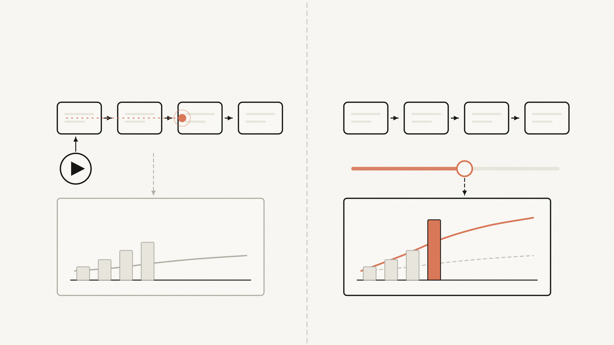
I spent last week building an interactive lecture about how a large social feed decides what to rank, with hand-drawn architecture diagrams and a latency chart. I added a play button that sent a glowing dot through the pipeline: candidate sourcing, then ranking, then filtering, then out. It looked great. I watched it four times.
Then I asked what a viewer knew after watching that they did not know before, and the answer was nothing. The dot did not reveal a relationship. It re-stated the arrows that were already drawn on the diagram, more slowly. I had built a demonstration and told myself it was an explanation.
Bret Victor made this distinction in 2011 and it has not improved with age. His essay on explorable explanations is emphatic that the interactivity itself is not really the point, and that widgets which dump the reader in a sandbox and say figure it out for yourself are not explanations at all. The piece works as static text first; the reader is not forced to interact in order to learn, and interacts only to go deeper. In a postscript added in 2024, Victor notes with visible disappointment that the term now gets applied so broadly that it seems to mean any article with interactive pictures.
So here is the test I now apply before building any interaction: name the relationship the audience will discover by using it. If you cannot finish the sentence “by dragging this, they will find out that…”, cut the interaction and draw a better static picture.
Three kinds pass that test, in the order I reach for them.
1. Causal linkage: drag one thing, watch another respond. The Upshot’s rent-versus-buy calculator is the canonical example. It hands you the variables it cannot guess and says adjust these numbers to get an estimate for your situation, and it is careful to define what it is asserting, telling you the winning choice is the one that makes more financial sense over the long run rather than what you can afford today. What the reader discovers is a relationship, not a number: how long you stay dominates almost everything else. In a business deck this is your pricing model, your funnel, your hiring plan. Give them the slider that changes the conclusion.
2. Counterfactual removal: take a part out, see what breaks. Nicky Case’s Parable of the Polygons is built entirely on this. It lets you use a slider to adjust the shapes’ individual bias, and then does something better than a demonstration: it sets the world to a segregated state, invites you to remove the bias completely, and asks what happens. The answer is the whole argument. See what doesn’t happen? Nothing moves. Removing the cause does not undo the effect. No paragraph makes that point as hard as watching the grid sit there.
Design note: when you remove a component, leave a dashed ghost where it was. Removal that leaves a hole reads as a bug; removal that leaves an outline reads as an argument.
Case’s other well-known playable post, “The Evolution of Trust”, applies the same form to game theory. It sits alongside dozens of others in the explorabl.es directory, a self-described “hub for learning through play” and the best single place to go and steal interaction patterns.
3. Fold-to-focus: dim everything except one storyline. The weakest of the three, and still useful when you have many series and each reader cares about a different one. The pockets essay does this with objects rather than series: click an item, and brands that cannot fit it fade, because if the brand is faded, the item does not fit. The reader picks their own question and the chart answers it.
Distill’s momentum article is the version of this for a technical audience: two sliders, step size and momentum, sitting under a claim that the standard story fails to explain many important behaviours. You are not watching a process play. You are being handed the two knobs that make the claim true or false.
Keep the map on the screen
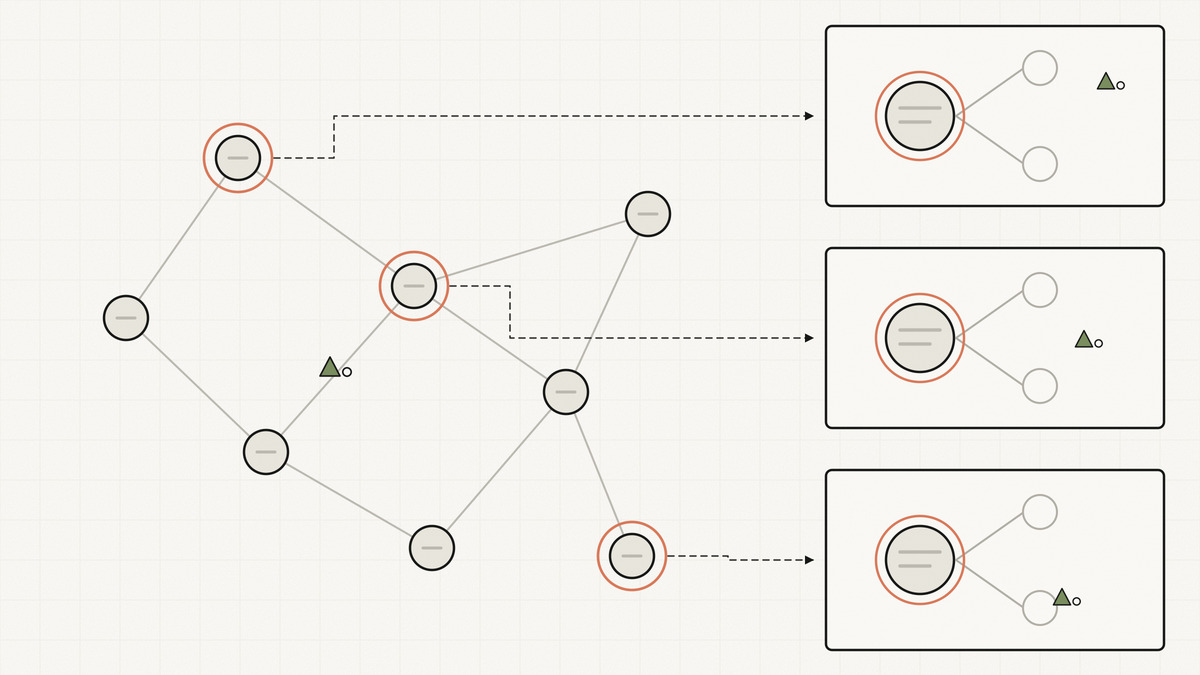
The failure mode of a detailed explanation is that the audience loses the plot around slide four and never says so.
The oldest fix in the field is still the best. Ben Shneiderman’s 1996 paper “The Eyes Have It” gives the visual information-seeking mantra as “overview first, zoom and filter, then details-on-demand”, inside a taxonomy of seven tasks: overview, zoom, filter, details-on-demand, relate, history and extract.
In practice, for a deck or a dashboard, that means three habits.
Draw the whole system once, early, and keep it. Every detail figure afterwards is a zoom into a node of that map, and it says which node. If you have ever watched a room go quiet during a deep-dive, this is the missing piece: they do not know where they are.
Give the reader a protagonist. Pick one concrete unit, a single customer, one request, one deal, and follow it through every figure. Recurring identity is what lets someone reconstruct the system from parts, and it is the same instinct as object constancy, applied to the narrative instead of the pixels.
Details arrive when asked for, not by default. A tooltip, a click, an expandable row. The overview is the promise; the detail is the payment.
The tools, honestly

The order that matters is: decide the message, choose the relationship, then pick a tool. Picking the tool first is how you end up with a stacked area chart of something that is not a part-to-whole.
| Tool | Comes with a look? | Reach for it when |
|---|---|---|
| Observable Plot | Yes | A standard chart, fast. Sensible defaults, and D3’s own docs note a histogram that takes 50 lines in D3 is one line in Plot |
| Apache ECharts | Yes | Dashboards and many charts that must look consistent; it advertises highly customizable charts out of the box |
| D3 | No | The shape you need does not exist yet. Scales, transitions, annotation, flow diagrams |
| Hand-authored SVG + CSS | No | A state change between two diagrams you drew yourself. Cheapest thing that works |
| Motion or GSAP Flip | No | Elements must keep their identity across a layout change |
| Scrollama | No | The argument should advance as the reader scrolls; it is a lightweight library for scrollytelling |
| Mermaid | Yes | A static diagram that should live in the repo as text; it renders Markdown-inspired text definitions and is the static-only case |
Two notes on that table.
D3’s “no” is the important cell. It is a toolbox, not a style, and the same documentation that explains its power says plainly that it is overkill for a private dashboard or a one-off analysis. Use Plot or ECharts unless you need a shape nobody has built.
And if you want a sense of how far the “one change at a time” discipline can be pushed by machine, 3Blue1Brown’s videos are rendered by manim, described by its author as an engine for precise programmatic animations designed for creating explanatory math videos. The precision is the point. Every frame changes exactly one thing on purpose.
The checklist
Run this against your next deck or dashboard. It takes about ten minutes and it is where most of the gain is.
- Every chart title states the finding, not the topic.
- Every chart carries exactly one message. Two findings means two charts.
- The chart type was chosen from the relationship you are showing.
- One accent colour. Everything that is context is grey.
- Semantic colours (risk, status) are not reused as series colours.
- No more than about seven categorical colours. Above that, regroup.
- Every chart has at least one annotation naming the thing you want seen.
- Direct labels on the series; legend deleted where possible.
- Any animation preserves identity: things move, they are not deleted and redrawn.
- Every interaction has a nameable relationship the reader discovers. If you cannot name it, cut it.
- There is one overview figure, and every detail figure says which part of it you are in.
Number 10 is the one I failed last week, and it is the one that removes the most work. Most interactions in business decks should not exist. The ones that survive that question are usually the best thing in the deck.
References and source passages
Primary sources for the principles
- Mike Bostock (creator of D3, author-published) — Original source: “Object Constancy”, dated May 16, 2012. Supporting passages: “Animated transitions are pretty, but they also serve a purpose: they make it easier to follow the data. This is known as object constancy: a graphical element that represents a particular data point (such as Ohio) can be tracked visually through the transition. This lessens the cognitive burden by using preattentive processing of motion rather than sequential scanning of labels.”; “Above all, animation should be meaningful. While it may be visually impressive for bars to fly around the screen during transitions, animation should only be used when it enhances understanding. Transitions between unrelated datasets or dimensions (e.g., from temperature to stock price) should use a simpler cross-fade or cut rather than gratuitous, nonsensical movement.”; “If you forget to specify a key function, the default join-by-index can be misleading!” — fetched 2026-09-03
- Ben Shneiderman, University of Maryland — Original source: “The Eyes Have It: A Task by Data Type Taxonomy for Information Visualizations”, Proceedings of the 1996 IEEE Symposium on Visual Languages, pp. 336–343 (DOI 10.1109/VL.1996.545307). Author-hosted PDF, freely readable; the DOI resolves to IEEE Xplore, which is gated, so the author’s copy is the link to click. The mantra is on PDF p. 2, printed p. 337, section 2 “Visual Information Seeking Mantra”. Supporting passage, verbatim: “Overview first, zoom and filter, then details-on-demand”. The abstract states it as “overview first, zoom and filter, then details on demand.” The seven tasks listed on the same page are: “Overview: Gain an overview of the entire collection. Zoom: Zoom in on items of interest”, followed by filter, details-on-demand, relate, history and extract. The seven data types are 1-, 2- and 3-dimensional data, temporal, multi-dimensional, tree and network data — fetched 2026-09-03; nearest archive snapshot 2026-08-25
- Bret Victor (author-published; the essay that named the form) — Original source: “Explorable Explanations”, dated March 10, 2011, with a postscript added February 2024. Supporting passages: “It’s tempting to be impressed by the novelty of an interactive widget such as this, but the interactivity itself is not really the point.”; “Most interactive widgets dump the user in a sandbox and say ‘figure it out for yourself’. Those are not explanations.”; “The reader is not forced to interact in order to learn. The reader interacts if they wants to go deeper, if they have piqued curiosity or unanswered questions.” (the grammatical slip is in the original); and from the 2024 postscript: “It has now been applied so broadly that it seems to mean ‘any article with interactive pictures’.” Note that Victor’s own definition is narrower than the one used in this article: “a written argument whose assertions are backed by explorable computational models, whose facts, assumptions, and calculations are all visible and editable” — fetched 2026-09-03
- John Lasseter — Original source: “Principles of Traditional Animation Applied to 3D Computer Animation”, ACM SIGGRAPH Computer Graphics, Vol. 21, No. 4, July 1987, pp. 35–44 (DOI 10.1145/37402.37407). Read from the freely hosted Carnegie Mellon course copy because the ACM Digital Library version is gated. Staging is section 2.4, PDF p. 4, printed p. 38. Supporting passages, verbatim across the PDF’s line breaks: “Staging is the presentation of an idea so it is completely and unmistakably clear; this principle translates directly from 2-D hand drawn animation.”; “It is important, when staging an action, that only one idea be seen by the audience at a time. If a lot of action is happening at once, the eye does not know where to look and the main idea of the action will be ‘upstaged’ and overlooked.”; “Each idea or action must be staged in the strongest and the simplest way before going on to the next idea or action. The animator is saying, in effect, ‘Look at this, now look at this, and now look at this.’” Lasseter’s paper lists eleven principles (printed p. 35) and attributes them throughout to reference [26], Frank Thomas and Ollie Johnston’s The Illusion of Life: Disney Animation (1981), which is the original codification. That book is not available in a freely readable edition, so this article cites the SIGGRAPH restatement and quotes only from it. Note the PDF is an OCR scan with occasional character errors elsewhere in the text; the passages quoted here are clean — fetched 2026-09-03; nearest archive snapshot 2024-08-06
Exemplars, cited as examples of the discipline rather than as authorities
- The New York Times, The Upshot — Original source: “Is It Better to Rent or Buy? A Financial Calculator.” by Mike Bostock, Shan Carter, Archie Tse and Francesca Paris, dated May 10, 2024, with a page note that “This calculator was updated in July 2025 to reflect current tax law” and a footer stating “This calculator was originally published in 2014.” The 2014 URL now redirects to this 2024 one. Supporting passages: “Adjust these numbers to get an estimate for your situation. These are some of the most important factors in your decision, and they’re the only ones we can’t estimate for you.”; “Note that the ‘winning choice’ is the one that makes more financial sense over the long run, not necessarily what you can afford today.” The page opened without a paywall on the fetch date, though nytimes.com intermittently returns 403 to automated requests, so the archive snapshot below is the reliable fallback — fetched 2026-09-03; nearest archive snapshot 2026-07-26
- The New York Times, The Upshot — Original source: “How the Recession Reshaped the Economy, in 255 Charts” by Jeremy Ashkenas and Alicia Parlapiano, June 5, 2014, updated June 6, 2014. Supporting passages: the “How to read this chart” panel reads “Each line on the chart represents a private-sector industry and shows that industry’s change in employment over the last decade. The lines are placed on the x axis (horizontally) based on the average wages paid in that industry.” The section headings, quoted in this article as claim-style titles, are “A Mixed Recovery”, “More Bad — and Good — Jobs”, “The Medical Economy”, “A Long Housing Bust”, “Made in America”, “Black Gold Rush”, “Digital Revolution” and “Grooming Boom”. The piece also publishes a correction dated June 5, 2014 about a calculation error — fetched 2026-09-03; nearest archive snapshot 2026-01-12
- Vi Hart and Nicky Case — Original source: “Parable of the Polygons”, a playable post based on Thomas Schelling’s 1971 paper “Dynamic Models of Segregation”. Supporting passages: “use the slider to adjust the shapes’ individual bias”; “world starts segregated. what happens when you lower the bias?” followed by “See what doesn’t happen? No change. No mixing back together. In a world where bias ever existed, being unbiased isn’t enough!”; and the conclusion “Small individual bias → Large collective bias.” Cited here for its interaction design, specifically the counterfactual-removal pattern, not for its social-science claims — fetched 2026-09-03
- The Pudding, by Jan Diehm and Amber Thomas — Original source: “Women’s Pockets are Inferior”, August 2018. Supporting passages: “On average, the pockets in women’s jeans are 48% shorter and 6.5% narrower than men’s pockets.” (measured across 80 pairs of jeans from 20 brands, all with a 32-inch waistband, per the Methods section); “Heads up, you’re about to experience some scroll-driven animations. If you’d like to skip that, you can jump ahead to the final state.”; “Click an item below to test the fit in each pocket.” and “If the brand is faded, the item does not fit.” The site describes itself on the same page: “The Pudding explains ideas debated in culture with visual essays.” — fetched 2026-09-03; nearest archive snapshot 2026-08-19
- Gabriel Goh, Distill — Original source: “Why Momentum Really Works”, April 4, 2017. Supporting passage: “This standard story isn’t wrong, but it fails to explain many important behaviors of momentum. In fact, momentum can be understood far more precisely if we study it on the right model.” The article’s controls are two labelled sliders, “Step-size α” and “Momentum β”, which drive every figure in the piece — fetched 2026-09-03; nearest archive snapshot 2026-08-27
- Financial Times Visual Journalism Team — Original source: Visual Vocabulary, in the FT’s chart-doctor repository. Supporting passages: the poster exists “to assist designers and journalists to select the optimal symbology for data visualisations”; “This is not an attempt to teach everyone how to make charts, but how to recognise the opportunities to use them effectively alongside words.”; and, under Correlation, “Show the relationship between two or more variables. Be mindful that, unless you tell them otherwise, many readers will assume the relationships you show them to be causal (i.e. one causes the other).” The README organises chart types under nine relationship categories, including deviation, correlation, ranking, distribution, change over time, magnitude, part-to-whole, spatial and flow — fetched 2026-09-03
- Explorable Explanations hub — Original source: explorabl.es, a directory of playable explanations. Supporting passage from the page body: “Welcome to Explorable Explanations, a hub for learning through play!” Nicky Case’s “The Evolution of Trust” is listed there; its landing page, opened in a browser on 2026-09-03, credits “by nicky case, july 2017”, states a “playing time: 30 min”, and opens on a single PLAY control. The rest of the piece is drawn by script one slide at a time, so this article describes only its form and does not characterise its individual interactions — fetched 2026-09-03
Tools, cited for facts about the tool
- Observable (the company that maintains D3) — Original source: “What is D3?”, the official documentation. Supporting passages: “D3 is a low-level toolbox”; “D3 is not a charting library in the traditional sense. It has no concept of ‘charts’. When you visualize data with D3, you compose a variety of primitives.”; “Don’t get seduced by whizbang examples: many of them took an immense effort to implement!”; “D3 makes sense for media organizations such as The New York Times or The Pudding, where a single graphic may be seen by a million readers”; “On the other hand, D3 is overkill for throwing together a private dashboard or a one-off analysis.”; “Whereas a histogram in D3 might require 50 lines of code, Plot can do it in one!” Vendor-published, and quoted here only for D3’s description of itself — fetched 2026-09-03
- Observable — Original source: Observable Plot repository. Supporting passage: “Observable Plot is a free, open-source, JavaScript library for visualizing tabular data, focused on accelerating exploratory data analysis. It has a concise, memorable, yet expressive API, featuring scales and layered marks in the grammar of graphics style.” — fetched 2026-09-03
- Apache Software Foundation — Original source: Apache ECharts repository. Supporting passage: “Apache ECharts is a free, powerful charting and visualization library offering easy ways to add intuitive, interactive, and highly customizable charts to your commercial products.” — fetched 2026-09-03
- D3 — Original source: d3-scale-chromatic repository. Supporting passage: “This module provides sequential, diverging and categorical color schemes designed to work with d3-scale’s scaleOrdinal and scaleSequential. Most of these schemes are derived from Cynthia A. Brewer’s ColorBrewer.” — fetched 2026-09-03
- Susie Lu — Original source: d3-annotation repository. Repository description: “Use d3-annotation with built-in annotation types, or extend it to make custom annotations. It is made for d3-v4 in SVG.” Full documentation is at d3-annotation.susielu.com, whose body is rendered by script — fetched 2026-09-03
- D3 — Original source: d3-sankey repository. Supporting passage: “Sankey diagrams visualize the directed flow between nodes in an acyclic network.” — fetched 2026-09-03; nearest archive snapshot 2026-08-05
- GSAP (vendor documentation) — Original source: Flip plugin documentation. Supporting passages: “Flip records the current position/size/rotation of your elements, you make whatever changes you want, and then Flip applies offsets to make them look like they never moved… Lastly FLIP animates the removal of those offsets!”; “‘FLIP’ is an animation technique that stands for ‘First’, ‘Last’, ‘Invert’, ‘Play’ and was coined by Paul Lewis.” — fetched 2026-09-03; nearest archive snapshot 2026-08-28
- Motion (vendor documentation) — Original source: motion.dev. Describes itself as a “Production-grade animation library for the web”, MIT licensed, previously Framer Motion, with layout animation and hardware-accelerated scroll-linked motion among the listed features — fetched 2026-09-03
- Russell Goldenberg — Original source: Scrollama repository. Supporting passage: “Scrollama is a modern & lightweight JavaScript library for scrollytelling using IntersectionObserver in favor of scroll events.” and “The goal of this library is to provide a simple interface for creating scroll-driven interactives.” — fetched 2026-09-03; nearest archive snapshot 2026-08-21
- Mermaid — Original source: Mermaid introduction. Supporting passage: “It is a JavaScript based diagramming and charting tool that renders Markdown-inspired text definitions to create and modify diagrams dynamically.” — fetched 2026-09-03; nearest archive snapshot 2026-08-30
- Grant Sanderson (3Blue1Brown) — Original source: manim repository. Supporting passage: “Manim is an engine for precise programmatic animations, designed for creating explanatory math videos.” The README notes the repository “began as a personal project by the author of 3Blue1Brown for the purpose of animating those videos”, and that a separate community edition was forked in 2020 — fetched 2026-09-03
- Datawrapper (vendor blog; Datawrapper sells a charting tool, so this is a practitioner opinion rather than a neutral authority) — Original source: “What to consider when choosing colors for data visualization” by Lisa Charlotte Muth, May 29, 2018. Supporting passages: “Consider the color grey as the most important color in Data Vis. Using grey for less important elements in your chart makes your highlight colors (which should be reserved for your most important data points) stick out even more.”; “If you need more than seven colors in a chart, consider using another chart type or to group categories together.”; and the recommendation to “Use an online tool or Datawrapper’s automatic colorblind-check to make sure that color-blind users can distinguish the colors on your chart.” The article now lives at datawrapper.de/blog/colors; the older blog.datawrapper.de address redirects there — fetched 2026-09-03
- Ilia Blinderman, The Pudding — Original source: “How to Make Dope Shit, Part 1: Working with Data”. A practitioner account of the newsroom’s own workflow, self-published, cited for how the team works rather than as evidence about what good looks like. Supporting passage: the work relies on “an odd grab-bag of skills — critical thought, design, writing, and programming” — fetched 2026-09-03